One of the biggest myths in trading is this:
“If the trend is strong, it will keep going.”
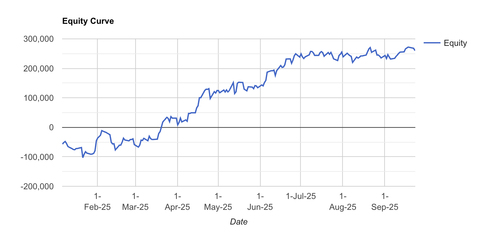
P.S.: The image attached above serves only as a representative example. Not an actual Algo recommendation
It feels logical, but markets don’t move in straight lines. Every uptrend (or downtrend) eventually loses steam, a stage we call trend exhaustion. The ability to spot this moment is what separates disciplined traders from those who give back their gains.
The Parameters That Matter
Before we get into stories and analogies, here are the key performance parameters that traders and algos should monitor when studying exhaustion, whether in market trends or in their own equity curves:
-
Win Rate: A modest but stable win rate can still compound profits if losses are capped.
-
Drawdowns: Both the size and duration show how well you manage exhaustion phases.
-
Sharpe & Sortino Ratios: Measure how smooth or volatile your returns are.
-
Monthly ROI: A steady slope signals momentum; flattening ROI is a warning sign.
-
Day-of-Week Patterns: Some days consistently perform, others drag, exhaustion often clusters around weak days.
-
Monthly Trends: Hot streaks followed by cooling months mirror trend lifecycles.
These parameters act like “vital signs”, they tell you when performance (or a market move) is powering ahead versus when it’s running out of breath.
Why Trends Exhaust
Think of a marathon runner. At the start, they’re fresh and fast. Midway, they maintain pace. But nearing the finish, fatigue sets in. Stride length shortens, energy fades, and the slowdown is obvious.
Markets behave the same way. Strong buying or selling eventually tires out. Demand dries up, volume thins, and momentum indicators diverge. Price may still edge higher, but the “force” behind it is fading.
That’s trend exhaustion.
How Algos Detect Exhaustion
Your algo doesn’t feel emotions, but it can measure fatigue with data:
-
Momentum Divergence: Price makes new highs, but RSI or MACD doesn’t confirm.
-
Volume Decline: Prices advance, but with shrinking participation.
-
Overextension: Price trades too far above averages, like a stretched rubber band.
-
Volatility Spikes: ATR jumps often mark climactic, unsustainable moves.
-
Reversal Patterns: Candlesticks like dojis or engulfing bars after long rallies act as red flags.
When these signals cluster, it’s often time to tighten stops, take partial exits, or prepare for reversals.
The Equity Curve Tells the Same Story
Exhaustion isn’t just visible in markets, your equity curve can show it too.
-
Early Pain: Most strategies begin with drawdowns or sideways phases, testing patience and conviction.
-
Momentum Phase: As setups align, the curve rises steadily, compounding smoothly.
-
Exhaustion Plateau: Over time, returns may flatten even if trades continue. The slope weakens, just like a tired trend losing strength.
This plateau is equity-curve exhaustion. It signals that ROI momentum is slowing, and it’s a cue to pause, adjust, or diversify.
Why This Matters
Ignoring exhaustion means:
• Giving back profits.
• Entering trades too late.
• Overtrading flat ROI phases.
Detecting exhaustion means:
• Locking in gains.
• Managing risk more effectively.
• Knowing when to step back, reset, or diversify strategies.
The Takeaway
Trends don’t end with fireworks, they fade with exhaustion. And the same applies to your equity curve.
By tracking both market signals (momentum, volume, volatility) and performance parameters (drawdowns, Sharpe, ROI), traders can sense when the market, or their strategy is running out of breath.
So the next time you see a strong run-up in price or in your PnL, ask yourself:
“Is this strength or exhaustion?”